

Discussion about the State of California’s efforts to advance the affirmatively furthering fair housing (AFFH) objective of increasing access to opportunity have typically framed neighborhood opportunity broadly, in terms of higher and lower levels of “resources,” rather than in terms of the specific characteristics of those neighborhoods. This framing is helpful in the context of policy design and also understandable because the State uses an opportunity map that assesses neighborhoods based on indicators that span multiple dimensions of opportunity and groups them into mapping categories. In this context, opportunity can be defined holistically and used as shorthand for the bundle of goods that a residential location provides. In another sense, however, this framing can obscure and even cause us to lose sight of the underlying opportunity-related neighborhood characteristics that have real effects on low-income families’ lives and long-term outcomes.
In the analysis presented below, we “peek under the hood” to better understand one important dimension of neighborhood opportunity: schools. Specifically, we explore the characteristics of school environments near family-serving affordable housing in California and assess whether these characteristics have changed following the introduction of opportunity area incentives in State affordable housing funding programs several years ago.[1] Findings from this analysis can equip stakeholders with a more detailed and specific understanding of school environments serving affordable housing residents when engaging in discussions around the State’s approach to AFFH – for example, how rates of chronic absenteeism compare between schools in higher and lower “resource” neighborhoods.
Methodology, key findings, and a brief discussion of this analysis are provided below, and summary statistics are included in a separate appendix.
Methodology
We assess six school characteristics – rates of student poverty, high school graduation, fourth grade math proficiency, fourth grade literacy proficiency, chronic absenteeism, and post-secondary enrollment – of traditional, non-fully virtual, public schools using data provided by the California Department of Education (CDE).[2,3,4] Mirroring the methodology used in the TCAC/HCD Opportunity Map, we determine school characteristic values by calculating the enrollment-weighted average of each characteristic from the three closest schools to the population-weighted centroid of a tract or rural block group (a proxy for neighborhoods) and to developments financed with Low Income Housing Tax Credits (LIHTCs). We then find the median value of these weighted averages statewide and regionally, to determine the “typical” attributes of schools in a region or near family-targeted affordable housing.
The first four school characteristics are included in the mapping methodology for the TCAC/HCD Opportunity Map. We also include chronic absenteeism and post-secondary enrollment rates because they are similarly linked to critical life outcomes and are otherwise considered important characteristics of school environments.[5]
We also include an assessment of racial segregation in schools, given its relevance to the AFFH objective of achieving a more integrated society, as well as research demonstrating the long-term benefits of school integration.[6] To measure school segregation, we created a metric that compares a school’s share of white students to the county’s average share of white students among all schools. Although this approach does not measure segregation of specific non-white groups, its advantage is that it can be applied to a variety of regional demographic contexts, and draws from similar school segregation measures from the literature which use the white share of students as a proxy for the overall level of segregation or integration.[7] In our measure, if the school’s white population is above the county share, the metric has a value greater than zero, and if the school’s white population is below the county share, the value is below zero. We then use the Jenks optimization method to find natural breaks in the distribution of metric values within each county, and divide schools into six categories, with the two groups with the highest values above zero comprising “white-segregated” schools (where white students are particularly overrepresented relative to other schools in the county) and the two groups with the lowest values below zero comprising “BIPOC-segregated” schools (where white students are particularly underrepresented relative to other schools in the county), and the middle two groups comprising a “low segregation/integrated” group.[8] See Table 3 in the technical appendix for the median share of white students in each category of schools by region. Statewide, white students comprise 4% of students in BIPOC-segregated schools, 27% in low-segregation/integrated schools, and 53% in white-segregated schools.
Analysis
Question 1: What are the characteristics of schools near family-targeted affordable housing developments financed with Low Income Housing Tax Credits (LIHTCs)?
The schools closest to large-family new construction LIHTC-financed developments in California have similar rates of chronic absenteeism, post-secondary enrollment, and high school graduation rates to a “typical” school in the state (based on median characteristics for all schools).[9] However, schools close to family-serving affordable housing have meaningfully lower rates of testing proficiency and higher student poverty rates than the “typical” school. Specifically, schools near these developments have a 10-percentage point higher student poverty rate at the median than the typical school in the state (74% vs. 64%), and a six-percentage point lower testing proficiency rate in both literacy (34% vs. 40%) and math (27% vs. 33%). For more detail, see Appendix Tables 1a and 1b.
We also find that, statewide, schools near family-serving affordable housing are more likely to be BIPOC-segregated than all schools (63% vs. 49%, respectively), less likely to be white-segregated (6% vs. 14%), and less likely to be low segregation/integrated (31% vs. 37%) – see Appendix Table 2. For context, white students comprise a median share of 4% in BIPOC-segregated schools, statewide, compared to 53% in white-segregated schools and 27% in low segregation/integrated schools (see Appendix Table 3).
Characteristics of schools near family-serving affordable housing vary by region, however.[10] For example, the median student poverty rate of nearby schools is 91% in Los Angeles and 47% in the Capital region (see Appendix Table 1a). The magnitude of difference between the characteristics of schools near family-serving affordable housing and the typical school also varies by region. For example, some regions have little to no difference in testing proficiency of schools near these developments and typical schools, like in the San Diego or Capital regions. In contrast, math and literacy proficiency rates for schools near affordable housing developments in the Bay Area are 15 and 14 percentage points lower than the median schools for the region, respectively (see Appendix Tables 1a and 1b).
School segregation patterns also vary by region. For example, 79% of schools near family-serving affordable housing in the Los Angeles region are BIPOC-segregated, compared to 53% in the San Diego region (see Appendix Table 2). Schools near affordable developments in San Diego are also at least twice as likely to be white-segregated (16%) than in any other region, where this share ranges from 2-8%. However, the following pattern is true in every region of the state: schools near family-serving affordable housing are more likely to be BIPOC-segregated, and less likely to be white-segregated and low segregation/integrated, than schools in the corresponding region.
Question 2: Does the TCAC/HCD Opportunity Map capture meaningful differences in school characteristics?
If schools are an important dimension of neighborhood opportunity, does the TCAC/HCD Opportunity Map effectively assess school environments? We find that the Opportunity Map’s methodology and mapping categories do capture meaningful differences in school environments, and that schools in higher resource areas have characteristics that diverge considerably from those of schools in lower resource areas and areas categorized as High-Poverty & Segregated.[11]
As shown in Table 1, schools near High and Highest Resource tracts and rural block groups have much higher rates of post-secondary enrollment, high school graduation, and testing proficiency and much lower rates of student poverty and chronic absenteeism than schools in Low Resource and High-Poverty & Segregated areas. For example, the median student poverty rate of schools in Highest Resource areas is 56 percentage points lower than in High-Poverty & Segregated areas (33% vs. 89%), and the difference in testing proficiency rates is approximately 37 percentage points for both testing subjects.
Table 1: School Characteristics by TCAC/HCD Opportunity Map Resource Category – Statewide*
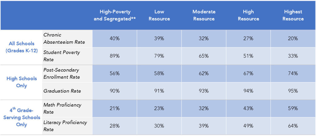
Source: 2020-2022 California Department of Education data (details in appendix). 2024 TCAC/HCD Opportunity Map data. This table also appears in the Appendix as Appendix Table 4.
* This table shows the median value of the enrollment-weighted average of each school characteristic for the three closest schools to a census tract or rural block group population-weighted centroid and is broken down by the TCAC Opportunity Map resource categories.
** Areas categorized as High-Poverty & Segregated are also assigned an opportunity score and category, meaning that these areas are also represented in the other columns of the table (typically in the Low Resource category).
Table 1 also shows notable differences in school characteristics between High and Highest Resource areas, which are in some cases similar in magnitude to the difference between High and Low Resource areas. For example, the difference in the fourth grade math proficiency rate between Highest (59%) and High (43%) Resource areas is 16 percentage points, compared to 20 percentage points between High (43%) and Low (23%) Resource areas. For fourth grade literacy, the difference in the proficiency rate between Highest (64%) and High (49%) Resource areas is 15 percentage points, compared to 19 percentage points between High (49%) and Low (30%) Resource areas. The degree of difference between the math and literacy proficiency rates of schools in Highest and High Resource areas is notable considering these areas are equally incentivized and combined into a single High/Highest Resource category in some policy contexts and affordable housing funding programs.
We also find that the TCAC/HCD Opportunity Map categories correspond to specific patterns of school segregation. As shown in Figure 1, schools in Low Resource areas are much more likely to be BIPOC-segregated (78%) than schools in Highest Resource areas (14%). The opposite pattern is true of white-segregated schools, which are rare in Low Resource areas (3%) and more common in Highest Resource areas (32%). Importantly, schools characterized as Low Segregation/Integrated are nearly three times more common in Highest Resource areas (54%), where they comprise the majority of schools, than in Low Resource areas (20%). In other words, schools are more racially integrated in higher resource areas than in lower resource areas, and most schools in higher resource areas are majority BIPOC.
Figure 1: TCAC/HCD Opportunity Map Resource Category by School Segregation Category – Statewide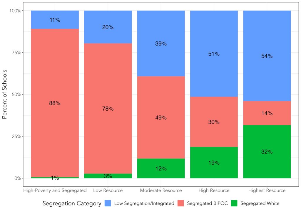
Source: 2020-2022 California Department of Education data (details above). 2024 TCAC/HCD Opportunity Map data.
* This chart shows the share of all schools in each TCAC/HCD Opportunity Map resource category (including the High-Poverty and Segregated overlay) by segregation category in the State.
This figure also appears in the Appendix as Appendix Figure 7.
Question 3: How have the characteristics of schools near family-serving affordable housing changed since the State adopted opportunity area incentives?
To assess whether State opportunity area incentives over the last several years have led to meaningful changes in school environments for families living in affordable housing, we compare the characteristics of schools near these developments in the respective pre- and post-incentive eras for the 4% and 9% LIHTC programs.[12]
We find that the characteristics of schools near family-serving developments financed with 4% LIHTCs shifted modestly in a positively-associated direction in the
post-incentive era, but that there were little and sometimes negatively-associated changes in the 9% program. For example, the median student poverty rate of schools near family-serving affordable housing was approximately 69% for both programs in the pre-incentive era, but post-incentive this rate increased to 75% for schools close to 9% LIHTC properties and dropped to 54% for schools near 4% LIHTC properties (see Appendix Figures 9 and 10). This trend is unsurprising given that prior research found a much greater shift towards development in higher resource areas in the 4% program than in the 9% program in their respective post-incentive eras.
Trends in school segregation followed a similar pattern, with modest change in the 4% program and very little change in the 9% program. Specifically, schools near family-serving affordable developments financed with 4% LIHTCs became less likely to be BIPOC-segregated in the post-incentive era (51% vs. 65% in the pre-incentive era) and more likely to be low segregation/integrated in the post-incentive era (44% vs. 31% in the pre-incentive era) – see Appendix Table 6. There was almost no corresponding change in the 9% program.
Limiting our view to family-serving developments in higher resource areas the post-incentive era, we find that school environments are broadly similar across the 4% and 9% LIHTC programs (see Appendix Table 5), with minor exceptions, such as higher student poverty rates in schools near developments financed with 9% LIHTCs in Highest Resource areas than 4% developments in these areas. These results suggest that overall differences in school characteristics between the two programs may be primarily due to the aforementioned larger shift toward development in higher resource areas in the 4% program than in the 9% program.
We also find that schools near developments in higher resource areas financed with both tax credit types in the post-incentive era have similar characteristics – in terms of rates absenteeism, poverty, post-secondary enrollment, high school graduation rates, and test scores – to the typical schools in higher resource areas in the state. These results suggest that the State’s opportunity area incentives are contributing to the placement of affordable housing for families near schools that are broadly reflective of schools serving higher resource areas, and that the lack of overall change in school environments near developments financed with 9% LIHTCs is not a result of these developments being located near schools with outlier characteristics in higher resource areas (e.g., schools with high rates of absenteeism and low test scores), but likely the result of other factors such as the relatively small shift toward development in higher resource areas or changes in school environments near developments in lower resource areas.
Finally, we find that in the post-incentive era, family-serving affordable developments in higher resource areas financed with both 4% and 9% LIHTCs are more likely to be located near low segregation/integrated schools than BIPOC-segregated schools. As a whole, these developments are substantially less likely to be located near BIPOC-segregated schools, and much more likely to be located near low segregation/integrated schools and white-segregated schools, than affordable developments as a whole.
Discussion
The broader context for our analysis first bears noting: the State’s use of the TCAC/HCD Opportunity Map to encourage affordable housing for low-income families to be built in higher resource neighborhoods is intended to advance the AFFH objective of increasing access to opportunity, but not other AFFH objectives, such as transforming racially and ethnically concentrated areas of poverty into areas of opportunity. These other objectives implicate school environments, are critical to the State’s approach to addressing segregation and its negative effects, and deserve the State’s full attention. Both mobility and place-based strategies are critical components of a comprehensive approach to advancing AFFH objectives, as we outlined in a prior policy brief.
Instead, our analysis is intended to help stakeholders understand, more narrowly, how the State’s approach to advancing the specific objective of increasing access to opportunity has impacted school environments for families living in LIHTC-financed affordable housing. To this end, we have two main observations:
First, we find that the State’s opportunity area incentives have led to modest increases in the likelihood that family-serving affordable housing financed with 4% LIHTCs is located in neighborhoods served by schools with higher test scores, lower rates of chronic absenteeism, and higher rates of post-secondary enrollment, among other differences. The 4% program has also seen a shift toward more racially integrated schools. However, little corresponding change has occurred in the 9% program. For this reason, TCAC should consider strengthening its opportunity area incentives.
We also find profound differences between school environments in higher and lower resource neighborhoods on the TCAC/HCD Opportunity Map. For example, the median 4th grade math proficiency rate is 59% for schools in Highest Resource areas and 21% for schools in Low Resource areas – a troubling gap, given school test scores’ association with long-term economic prospects for children from low-income families. Schools in higher resource neighborhoods are also more likely to be racially integrated than schools in lower resource areas, which are typically served by BIPOC-segregated schools with few white students present.
It is important to note that our analysis is exploratory and is limited in some ways. For example, while we assess several school characteristics given their association with long-term life outcomes and opportunity, they are not direct measures of school quality, per se. Given the impact of additional influences on student learning (e.g. family, social networks, neighborhoods), some researchers have argued that test score growth is a better measure of school quality and schooling’s impact on student learning than static test scores, even if test scores in local public schools are strongly associated with long-term outcomes for low-income children in that neighborhood.[13] Expanding this research to include test score growth could provide a more nuanced picture of school environments. In addition, this analysis does not account for within-school dynamics, for which there is no widely available data, but which research has shown can considerably influence degrees of racial and economic integration and long-term outcomes for children from families with low incomes.[14]
ABOUT THE AUTHORs
 |
Yasmin Givens provides analytical support for the Partnership’s research, policy analysis, and program evaluation efforts. She previously worked in housing and education policy research with the Lincoln Institute of Land Policy and the Houston Education Research Consortium. |
 |
Dan Rinzler leads the Partnership’s policy and research initiatives around affordable housing preservation, development and their social impact. He previously worked in housing program development and impact assessment with the Low Income Investment Fund (LIIF) and as an urban planning consultant in the San Francisco Bay Area. Special thanks to Matt Alvarez-Nissen, Senior Research/Policy Associate at the California Housing Partnership, for providing support and review of the data analysis above. |
Endnotes
- Prior analyses on the characteristics of schools near families receiving housing assistance (Ellen and Horn 2018) were national in scale and did not speak to the specific policy context of California.
- In this analysis, we use free or reduced-price meal eligibility as a proxy for student poverty. The Income Eligibility Guidelines provided by the California Department of Education are used by schools and other institutions to determine household eligibility for income-restricted nutrition programs. Students with family incomes below 130% of the federal poverty line are eligible for free lunch and those with family income between 130% and 185% of the poverty line are eligible for reduced-priced meals.
- Community Eligibility Provision (CEP) schools provide free meals to all students, regardless of individual qualification, and do not collect meal eligibility applications from students’ households. As a result, they are unable to provide a count of student free- or reduced-price meal eligibility (FRPM) and instead the data provided by the CDE for these schools utilizes the Identified Student Percentage, the percent of students who are directly certified for meals at no cost on the basis of their participation in state welfare programs such as CalFresh and CalWORKs as well as students certified as homeless, migrant, foster, runaway, or participating in the Head Start program.
- For both math and literacy testing proficiency, we follow the TCAC/HCD Opportunity Map methodology as defining proficiency as the percent of students who meet or exceed grade proficiency standards for that subject.
- For example, research has shown that frequent school absences can negatively impact grades and test score performance (Liu, Lee, and Gershenson 2021; Aucejo and Romano 2016). Poor school attendance can also be a predictor of dropping out of high school, which has been linked to higher rates of poverty and poor labor market prospects (Robert Wood Johnson Foundation 2016; Binder and Bound 2019; US Dept of Education 2019). Additionally, a large body of literature highlights the positive impacts of college attendance, with college graduates experiencing lower rates of unemployment, higher incomes, and greater lifetime earnings than those whose highest degree is a high school diploma (Broady and Hershbein 2020; Tamborini, Kim, and Sakamoto 2015; Association of Public & Land-Grant Universities; Healthy People 2030).
- See, for example: Johnson, Rucker C. Children of the Dream: Why School Integration Works (2019). New York, NY: Basic Books and Russell Sage Foundation Press.
- Prior research has not settled on a single definition of segregated or integrated schools, and the approach may vary depending on the intended application or context, such as if segregation of specific racial or ethnic groups are of particular interest. Our approach is an adaptation of the definition used in Schneider, et al (2021), which draws from other literature on school segregation measures. In this definition,white students are assumed to have a level of social advantage and thus must represent a minimum share of a student population for a school to be considered racially integrated.
- The Jenks optimization method clusters data into groups that minimize within-group variance and maximize between-group variance. See also: Jenks, George F. 1967. “The Data Model Concept in Statistical Mapping,” International Yearbook of Cartography 7: 186-190.
- For the purpose of this analysis, we utilize the definition of “large-family” defined in the TCAC regulations – Section 10325(g)(1)(A) through (I).
- Region definitions in this analysis are the same as those used in the TCAC/HCD Opportunity Map and include the following: Bay Area, Capital, Central Coast, Central Valley, Inland Empire, Los Angeles, Orange County, Rural, and San Diego.
- In this analysis, higher resource areas are defined as High and Highest Resource areas and lower resource areas as Moderate and Low Resource in the 2024 TCAC/HCD Opportunity Map. For more information: https://www.treasurer.ca.gov/ctcac/opportunity.asp
- For the 9% LIHTC program, the pre-incentive period is 2015-2018 and the post-incentive period is 2019-2022. For the 4% LIHTC program, the pre-incentive period is 2017-2020 and a post-incentive period is 2021-2022.
- See “Educational Opportunity in Early and Middle Childhood: Using Full Population Administrative Data to Study Variation by Place and Age” by Sean Reardon, 2019.
- See “Social Capital II: Determinants of Economic Connectedness” by Chetty, et al, 2022.